
B2C Travel Planning Website Application Design
EUTrip.com
A website application designed for Non-European 'EU travelers' to plan their Europe trip and manage the VISA required documentation prior to VISA application. The resulting design was tested with target users and gained positive feedback.
My Role /
UX Designer | Researcher
Timeline /
Jan. 01- 07. 2021
Type /
Individual |
Design Sprint Project
Tools /
Adobe XD | Figma
Overview \
My Approach - Design Sprint
This is an individual passion project that I was self-motivated to design a product that can help people who are experiencing similar problems of planning the Europe trips as I did. In order to make the process more efficient, I selected Design Sprint as the framework to guide me through because I wanted to practice my design skills within an intensive timeline.
My Solutions
I designed an end-to-end EU travel planning website application and made the hi-fi prototype that mainly focuses on 5 functions targeting 5 key pain points.
Multi-destination Trip Builder
EuTrip helps build up an optimal travel route with multiple destinations. Based on users' input information on their entire trip duration and preferred destinations, EuTrip will suggest the destinations' order and the time of stay for each destination. Because travelers bother to carefully plan the order of destinations and duration of stay for each.


One-Screen Transports Manager
EuTrip organizes different international and local transportation choices on the same screen, which will be easier for users to figure out all potential transport options at first glance and switch between different choices. Because travelers find it difficult to figure out the various local transport methods in Europe due to lack of prior exposure.

Attractions Reservation Assistant
EuTrip recommends users the 'must to go' places in their destinations. It provides information on each attraction that needs a reservation, and users can make a reservation immediately. Otherwise, EU travelers may miss some of the exotic charms due to the lack of awareness of reservation requirements

Budget Control Panel
EuTrip tracks users' spending on the trip in real-time. It tells users detailed information on how much they have spent. Because travelers lack a real-time overview of how much they have spent in the middle of the booking process

VISA Documentation Manager
EuTrip categorizes all VISA required documentation into four groups, which are clearly shown on the same page. Users can quickly review, upload, and print the required documentation. Because it is hard to prepare paper documentation of booking receipts across different platforms

Research \
Long Term Goal - What do I want to achieve?
Create a travel assistant platform that is simple, organized, efficient, adaptable, and hassle-free for EU travelers so that they can enjoy their trips without concerning too much about researching, planning, managing, and administrative tasks
Persona - Whom do I design for?
To better guide my design and be able to empathize with our users, I came up with the following personas. The application was designed for the younger population, mainly for Gen Z.
.png)
Name: Jana
Age: 23
Occupancy: Graduate Student
Travel Experience: Backpacker, Never been to EU
VASI Application Experience: Never applied by herself
Name: Peter
Age: 20
Occupancy: Undergraduate Student
Travel Experience: Never travel abroad
VASI Application Experience: Never applied
HMW Notes - What problems users might have?
I brainstormed a variety of problems the personas might come across during the EU trip planning process and brought up the How Might We questions

General User Journey Map - What tasks users might go through?
Based on How Might We notes, I classified the tasks EU travelers might have and sorted out a general user journey map, including Pre-trip, During-trip, and Post-trip three stages

Exper Interview - What are the key pain points?
In order to figure what are key pain points for travelers and narrow down the scope, I interviewed 6 experienced EU travelers and highlight 5 key pain points throughout the trip planning process:
Hard to Preplan Multiple Destinations
Europe trips normally involve multiple destinations. Travelers bother to carefully plan the order of destinations and duration of stay for each.
“ I found the route planning part is very stressful. I had to plan a route connecting all the cities and decide how long I should stay in each city, sometimes, I just don’t know what is the best option.”
Unfamiliar with Local Transportation Choice
Non-European EU travelers find it difficult to figure out and wisely compare the various local transport methods in Europe due to lack of prior exposure.
“ I had no idea how can I book the local transports like buses, trains, trams in Italy when I planned my EU trip for the first time ... especially the websites were not even in English”
Unaware of the Reservation Request of Attractions
Due to the lack of awareness of reservation requirements, travelers may miss some exotic charms.
“ I didn’t kook the ticket to British Museum in advance just because I didn't know the reservation request, and then I waited for 3 hours in the line.”
Have Difficulty with Budget Control
Travelers lack a real-time overview of how much they have spent in the middle of the booking process.
“It’s easy to lose track of the budget… It’s just really frustrating if I don’t know how much I’ve spent”
Bothered with VISA Documentation Management
Schengen Visa requests travelers to provide detailed receipts of their trips. It is hard to prepare paper documentation of booking receipts across different platforms
“I spent 2 days just sorting out all the paper documents they ask for the VISA application”
“They rejected me just because I forget to book the hotel for the last two days of my trip”
Focused User Journey Map - What are the major tasks?
Based on the result of the expert interviews, users' pain points are primarily under the Pre-trip stage. Therefore, I defined the Pre-trip tasks as the scope of MVP
Key research takeaways:
I synthesized the findings from my research process and identified the 5 key pain points. Based on the pain points, I further specified five user flows as the scope of my Minimum Viable Prototype (MVP).
Hard to Preplan Multiple Destinations
Unfamiliar with Local Transportation Choice
Unaware of the Reservation Request of Attractions
Have Difficulty with Budget Control
Bothered with VISA Documentation Management
Multi-destination Trip Builder
One-Screen Transports Manager
Attractions Reservation Assistant
Budget Control Panel
VISA Documentation Manager
Design \
Lightning Screenshot Demos - What solutions are in the market?
Every great invention is built on existing ideas. In order to understand what we have in the market are doing well that I can borrow and what are not doing great hat I should avoid. I looked at great solutions from a range of companies in the market and learned from others.
Good example for for attractions reservation screen

For example, Airbnb has this information cards and interactive map side-by-side design. I found this layout is very clear to read and easy to interact with for users.
Good example for VISA documentation screen

Also, for the document management page, showing users which docs are completed and which are uncompleted could be helpful for them to keep track of the document preparation process.
Crazy 8s - What could be the static screen layout?
Inspired by the existing solutions and combined with my unique focus, I sketched a variation of my best ideas. At this stage, I was focusing on the static layout of screens

Low-fi Prototype - What could be the interactive user flows?
I moved on to the low-fi. At this stage, I not only wanted to test the static screen layout but also the flows between screens and the interactions on each screen. I designed 5 user flows as my MVP and each of them is tailored to a key pain point
User Flow 1: Multi-destination Trip Builder

Considerations:
1. Improve the visual attraction on the packages display
2. Use stepper for the “stay # days” to modify the durat
User Flow 2: One-Screen Transports Manager

Key features:
1. Review the recommended optimal route
2. Review and switch between different transport options & book all transport tickets at once
User Flow 3: Attractions Reservation Assistant

Considerations:
1. Review different recommended attraction options & Switch between different destinations
2. Use the same layout for accommodations & attractions reservation screens for a better visual consistency
User Flow 4: Budget Control Panel

User Flow 5: VISA Documentation Manager

Iteration \
Hi-Fi Prototype Usability Testing
In order to understand if my solutions capture target users' needs and the MVPs are intuitive for them. I carried out 5 usability testing sessions with targey users to test the five user flows of my MVPs.
Positive Feedback
5/5 target users would like to pay for this product
5/5 target users think the workflows are intuitive
5/5 target users think the user interfaces are visually appealing
“ This is exactly what I was looking for in the market, I wish I had this tool when I traveled to Europe!”
--- Michael
“ I will definitely use it if it got shipped one day!”
--- Lisa
Improvements
Other than the positive feedback from the target users, I also got many valuable improvements from A|B Testing, Questions, and Observations during the testing sessions and made iterations to reach the final validated design solutions
A | B Testing on Home Page Layout

Plan B: Symmetrical Layout with Tiers
Plan A: Asymmetrical Layout
Pros:
-
Dynamic layout
-
Easy to highlight some certain piece of package or ads
Cons:
-
Unclear hierarchy of information
Pros:
-
Organized layout
-
Easy to classify the same types of packages
Cons:
-
A bit dull feeling
Conclusion:
Users preferred Plan B, the symmetrical layout because it provides more readable and hierarchical information.

Issue:
Users ignored the stepper and missed the chance to modify the recommended duration
Iteration on Stepper
Improvement:
Enlarge the size of steppers to make them more noticeable
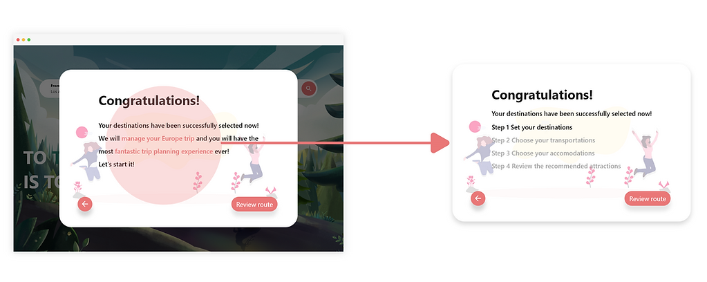
Iteration on Congrats Message
Improvement:
Clearly list out the all the following steps needed to complete
Issue:
Users misunderstood the congratulation message. They lacked awareness of the following steps

Iteration on Transport Options Review
Improvement:
Use the hover-over effect to give users the transport information when they hover the corresponding route
Issue:
Users misunderstood the implications of transport badges. I could not understand they are different transport options

Iteration on Budget Input Field
Issue:
Users ignored the input field to indicate their budget because the accounting table drew their attention more
Improvement:
Enlarged the input field across the whole page to make it impossible to be ignored
Iteration on Complete/Imcomplete Notification

Conclusion:
Users preferred Plan B because the summary card has a clearer UI design and easy to read.
Plan B: Summary Card
Plan A: Hover-over Effect
Final Solutions \
I designed a desktop application that helps EU travelers preplan their trips; control their budget and manage their VISA documentation


Provide users different travel packages if they don't want to plan the trip by themselves
Browsing Home Page

Ask for users the information on the trip, such as departure location, date, trip duration, number of guests
Multi-destination Trip Builder - 1

Suggest the stay of duration in each destination based on their input information on interested places and duration of entire trip
Multi-destination Trip Builder - 2

Show users all the potential transport methods and the associated route of each transport on an interactive map
One-Screen Transports Manager - 1

Show users all the potential transport methods on the same screen, users can book the flight tickets
One-Screen Transports Manager - 2

Users can also book the various local transport tickets and switch between the different transport methods
One-Screen Transports Manager - 3

Show users the attraction choices in the multiple destinations, users can switch between cities and book the reservations
Attractions Reservation Assistant

Show users their up-to-date budget in the middle of booking process
Budget Control Panel

Organize the VISA application required documents into 4 groups. Help users upload the required documents.
VISA Documentation Manager - 1

Help users print out the required documents and get ready fro the VISA application appointment
VISA Documentation Manager - 2
Reflection \
What I Did Well?
-
Self Motivation: Self-motivated to do this side project because of my passion for product design
-
Rapid Hi-fi Prototype: Rapidly created a product with a high-level visual polish
-
Time Management: Planned ahead for the design, research, and recruiting tasks in order to keep everything on time
What I Can Improve?
-
Made this a collaboration: I wish I recruited some UX researchers to help me with the research parts so that I can have more solid research findings
-
Think about more use cases: For this prototype, I use the single traveler as my example. However, it might bring in some differences if there are a group of travelers
-
Usability testing with business metrics: If I had enough resources, I will set up some business metrics and recruit tons of users to test on my prototype for multiple rounds
What Did I Learn?
-
Space Balance: Unlike mobile application design, designing for desktop applications needs us to have more considerations on each screen's layout and components. It is crucial to wisely arrange the UI elements to help users complete the tasks while having a pleasant experience
-
Visual Prioritization: One of the considerations for desktop design is to have a logical visual hierarchy. As designers, we need to prioritize the most important element on the page without overwhelming information, so that users can quickly figure out the main function on each page without hesitation